January 20 2011
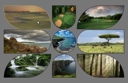

Click here » The IMGr jQuery Plugin used for Landing page with Rounded Images « to view the EXAMPLE.
Click here » The IMGr jQuery Plugin used for Landing page with Rounded Images « to download the full DEMO.
IMGr stands for Image Rounder and it’s a jQuery plugin and in this tutorial I used it to create a nice looking and unique landing page. For the developers it is very easy to create something that will be still and never be changed so the real troubles and headaches are coming when something twisted has to be editable from some CMS. This example can be easily modified to your CMS and these rounded images can be replaced from there; no need for photoshop editing of the images and creating PNG images that will be transparent because the images are normal rectangle .JPG images, just like these.

This is the HTML that I’ve used for this example.
<div style=”padding:100px 100px 200px 500px;”>
<div>
<a id=”link1″ href=“#”><img class=”ex1″ src=“timthumb1.jpg” height=”120″ width=”240″ /></a>
<a id=”link2″ href=“#”><img class=”ex2″ src=“timthumb2.jpg” height=”120″ width=”120″ /></a>
<a id=”link3″ href=“#”><img class=”ex3″ src=“timthumb3.jpg” height=”120″ width=”240″ /></a>
</div>
<div>
<a id=”link4″ href=“#”><img class=”ex4″ src=“timthumb4.jpg” height=”120″ width=”240″ /></a>
<a id=”link5″ href=“#”><img class=”ex5″ src=“timthumb5.jpg” height=”120″ width=”120″ /></a>
<a id=”link6″ href=“#”><img class=”ex6″ src=“timthumb6.jpg” height=”120″ width=”240″ /></a>
</div>
<div>
<a id=”link7″ href=“#”><img class=”ex7″ src=“timthumb7.jpg” height=”120″ width=”240″ /></a>
<a id=”link8″ href=“#”><img class=”ex8″ src=“timthumb8.jpg” height=”120″ width=”120″ /></a>
<a id=”link9″ href=“#”><img class=”ex9″ src=“timthumb9.jpg” height=”120″ width=”240″ /></a>
</div>
</div>
As you can see the HTML structure, there is one div that is used as a wrapper and three divisions within. Every division contains three image links and their dimensions are set exactly to fit with my design. These are the links that will lead you to the following pages of your web site. Every anchor has it’s own id and every image is associated to specific class. Now it’s time to use the IMGr plugin. Two javascript files must be included, first the main jQuery library and than the IMGr.
After the setup is done, it’s time to use the IMGr plugin. Let’s examine this line of code $(“img.ex1″).imgr({size:”1px”,color:”black”,radius:”0px 120px 0px 120px”}); Via first selector we have selected all images that are associated with ext1 class. The .img() method is applied to all these images. This method is wrapping the images with a span element and there are a few parameters that can be set.
First parameter is the size of the border that can be set and shown on the rounded image and it must be in pixels.
The second is the colour of the border. There are approximately 100 predefined colors such as aqua, azure, beige, bisque, black, blue, violet, brown etc. also you can write the hex code for the colour that you want.
Radius is the third parameter that can provide you to set the radius of every angle of the image and it must be in this format radius:”0px 120px 0px 120px”. Every number is associated with the radius of specific angle.
First – TL(Top Left); Second – TR(Top Right); Third – BR(Bottom Right); Fourth – BL(Bottom Left).
There is another parameter that can be set and that is the style of the border but I don’t use it for this example because its default value is set to “solid” and that was the style that I want to use so that’s why I don’t change it.
This will work on every browser including IE6. I’ve added one more functionality that created me troubles only in IE8 and I haven’t fixed it yet. I’ve added some pieces of jQuery code.
$(“img.ex1″).hover(function() {
$(this).imgr({size:”1px”,color:”yellow”,radius:”0px 100px 0px 100px”});
$(“#link1”).children(“span.imgr”).animate({opacity: ‘0.5’}, 80);
} ,
function() {
$(this).imgr({size:”1px”,color:”black”,radius:”0px 120px 0px 120px”});
$(“#link1”).children(“span.imgr”).animate({opacity: ‘1’}, 80);
} );
As you can see, I’ve created hover function for every image that makes some transformations such as changing the colour of the border (in this case to yellow) and changing the radius for some angles. Also I’ve used the .animate() method to create a nice animation that makes quick reducing the opacity of the image. Also there is a callback function that resets the changed properties to defaults.
Here is the full jQuery code, except for the other seven remaining images.
Click here » The IMGr jQuery Plugin used for Landing page with Rounded Images « to view the EXAMPLE.
Click here » The IMGr jQuery Plugin used for Landing page with Rounded Images « to download the full DEMO.
September 21 2010
First of all I want to say Hi and Welcome to our Web Design Blog. This is our first blog post and as a introduction a few words about the basics of the web design. So comments are more than welcomed! Let’s start!
The elements that are using for web and print design are the same. The big difference between these two type of designs are the different rules that are implementing for each kind of design. Some print designs can not be implemented for web.
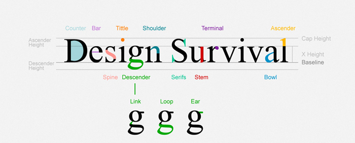
We must be careful when we want to use some font when its talking about web. There is a elis Fonts are the way your text looks on a Web page.
And most Web pages have large amounts of text. When you’re thinking of design, you need to think about how the text looks on a micro-level (the font glyphs, what font family, etc.) as well as the macro-level (positioning blocks of text and adjusting the size and shape of the text).
This is the list of font-family that can be used for web:
| font-family: Arial, Helvetica, sans-serif; font-family: ‘Arial Black’, Gadget, sans-serif; font-family: ‘Bookman Old Style’, serif; font-family: ‘Comic Sans MS’, cursive; font-family: Courier, monospace; font-family: ‘Courier New’, Courier, monospace; font-family: Garamond, serif; font-family: Georgia, serif; font-family: Impact, Charcoal, sans-serif; font-family: ‘Lucida Console’, Monaco, monospace; |
font-family: ‘Lucida Sans Unicode’, ‘Lucida Grande’, sans-serif; font-family: ‘MS Sans Serif’, Geneva, sans-serif; font-family: ‘MS Serif’, ‘New York’, sans-serif; font-family: ‘Palatino Linotype’, ‘Book Antiqua’, Palatino, serif; font-family: Symbol, sans-serif; font-family: Tahoma, Geneva, sans-serif; font-family: ‘Times New Roman’, Times, serif; font-family: ‘Trebuchet MS’, Helvetica, sans-serif; font-family: Verdana, Geneva, sans-serif; font-family: Webdings, sans-serif; font-family: Wingdings, ‘Zapf Dingbats’, sans-serif; |
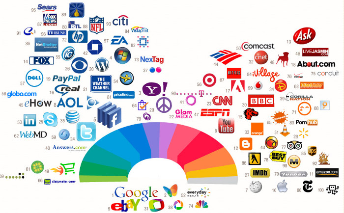
If you can notice form the image the most successful companies on the web are using the same pallete of colors for their logos and also for theis websites. Color is everywhere. It’s how we dress up our world and how we see things. Color has meaning beyond just “red” or “blue” and color is an important design element.
Graphics are the fun part of most Web pages. As the saying goes “a picture is worth 1,000 words” and that’s also true in Web design.
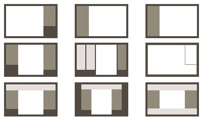
When people think of Web design often what they mean is the layout. Layout is the organization of elements on a Web page. First you need to start with basic design principles. Once you understand them, you can move through how to place elements on your Web page. These links and resources will take you through the steps to learn good Web layout design.
Navigation is how your customers get around from one page to another on a Web site. Navigation provides movement and gives your customers the chance to find other elements of your site. You need to make sure that the structure of your Web site (the information architecture) makes sense so that your customers aren’t forced to simply use search.
Accessibility and usability are often seen as a detriment to Web design, but a good designer focuses on making their site useful to as many people as possible. The links below take you through the basics of making an accessible site without compromising the design.
Most Web designers prefer to work in WYSIWYG or “What You See Is What You Get” editors because they provide a visual interface to the design. But finding the best Web design software is more than just WYSIWYG or not. Plus there are other tools you will need to build Web pages beyond just the Web editor.
For Windows and MAC the most popular WYSIWYG ediotr is Dreamweaver, but it’s not free.
![]()
There are WYSIWYG editors for other operating systems such as Linux to, one of them is Nvu. It’s comletly free. For Linux the Nvu verrion is called KompoZer open-source.
I want to share this post with you readers because I think it’s very useful and some information are taken from About.com some are written by me from my personal experience with the web design.