May 17 2018

Flat design is a web design trend standing for minimalism and cleanness in the website design industry. This trend has become popular since 2012, replacing the Skeuomorphism trend – the most popular trend until then. Unlike skeuomorphism, which is characterized by real-life 3D objects and shiny buttons, flat design is recognizable for its flat shapes and objects; not generating depth, dimension or any effects, such as drop shadows, highlights and realistic textures.
The goal of the flat design is users to put their focus on the content, by providing faster and more functional user experience. People undoubtedly are associating this trend with simplicity and cleanliness, modern and colourful design.
The biggest advantage is mentioned in the compatibility with responsive design. Users easily embraced the trend because it offered them quick and easy content access. They are able to use the websites very easily and the loading time is faster. Flexible framework – grid is allowing the design to be organized in consistent geometric shapes. This is another advantage of the flat design that allows content to be easily scanned and navigated. When designs don`t use shadows in the typography, you as a user can read the text very easy. The most used typography font that designers are using is the Sans-Serif font.
Designers love the flat design. They can make beautiful web projects, by using bright colours and simple typefaces. However, there is one problem: users were confused about the design and didn’t know what to do or how the interface was working. There was a need for a new web design trend – Flat design 2.0.
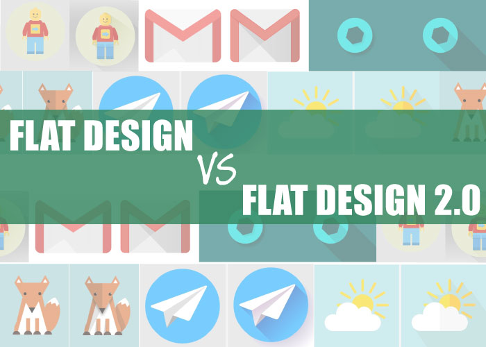
While the flat design was considered as a revolution, the flat design 2.0 is treated as evolution. It has the same characteristics of minimalism, but on the other hand, it adds more subtly skeuomorphic features. Some designers are calling this trend “almost-flat” design because they can add subtle shadows, highlights and layers. You can think of flat 2.0 as a way to overcome problems associated with flat design.
Besides adding depth and dimension to icons and illustrations, flat design 2.0 is focusing on adding large images and videos. Also, the long shadow is a very popular technique of flat 2.0. Clicking is simpler: attractive call-to-action (CTA) buttons are created with just outline and text inside. Maybe this is the most valuable feature for the users.
Flat design 2.0 is first mentioned in 2014 when Google relished its new design language – Material design. This is perhaps the most remarkable example of flat design 2.0. The base of material design is flat design with certain metaphors, where users can find similarity between the real and digital world.
We can conclude that flat design 2.0 is a web design trend, which is loved by both, designers and users too. It’s proven that flat 2.0 is a boom in UI design industry. What do you think will follow? Flat 3.0? What’s your opinion?
Update 21-st of June 2023
Flat Design 3.0 and Isometric Design are two prominent visual styles that have made a significant impact on the design landscape. Flat Design 3.0, an evolution of the minimalist design philosophy, embraces simplicity, clarity, and usability. It employs clean lines, vibrant colors, and a two-dimensional aesthetic to create a sleek and modern look. Flat Design 3.0 focuses on functionality, making it ideal for user interfaces, web design, and mobile applications.
On the other hand, Isometric Design offers a unique perspective by using parallel lines and angles to create a pseudo-3D effect. It brings depth and dimension to visuals, allowing for the representation of complex objects and architectural designs in a stylized and captivating manner. Isometric Design often finds its place in infographics, illustrations, and game design. Both styles have their strengths and cater to different design goals, with Flat Design 3.0 emphasizing simplicity and usability while Isometric Design adds visual interest and depth to create engaging and dynamic visuals. The choice between the two depends on the specific project requirements, desired visual impact, and the target audience.